
Landing pages are designed to increase conversions. They are dedicated pages that direct and guide a visitor to specific places. But simply making a landing page isn’t the end of your battle to secure conversions.
Distractions are everywhere, and 55% users spend less than 15 seconds on a page. You simply can’t afford to lose sales because of distractions, especially from those on your landing pages.
Indeed, your goal should be to keep visitors on your landing page only long enough to commit to a sale. So how do you plug the leaks? Here are 10 ways to increase conversions:
1. Low Page Load Times = Low Conversion Leaks
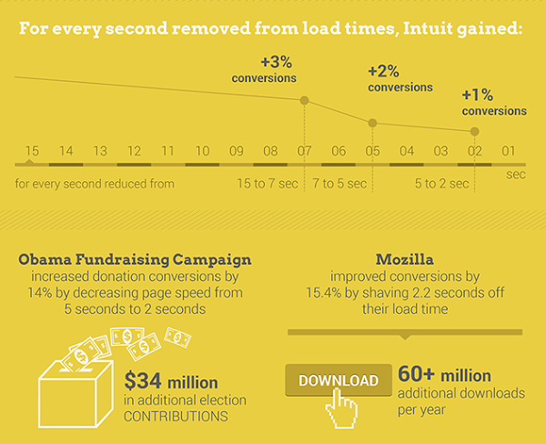
Your ideal landing page load times should be under three seconds. In fact, a delay of as little as 2 seconds can increase your landing page bounce rate by 103%.
For example, Mozilla was able to cut 2.2 seconds off page load time, which led to 15.4% higher conversions.
Even the Obama Fundraising Campaign managed to raise $34 million additional funds just by decreasing the page speed from five seconds to two seconds.

Remove the graphical elements that slow up load times, and avoid background autoplay GIFs and videos. They take a long time to load and can slow down the rest of the page, deterring and annoying visitors with frozen frames or black backgrounds.
Use as few elements as you can manage. Be minimalistic. The less you use, the faster your landing page loads.
Visitors are more likely to visit your website if your landing page loads in a flash; no delays, no fuss, and you deliver them straight to where you want them to be.
A hassle free experience goes a long way in crediting you with a good public image. Give your visitors an effortless and memorable experience.
2. Keep Your Audience Engrossed: Remove Possible Page Exits
The worst thing you can do with your landing page is to fill it with links that lead visitors away from the page. Keeping visitors in one place until they perform a particular action is the point of a landing page. If there are too many things screaming at them for attention, you won’t be able to keep their minds on any one thing.
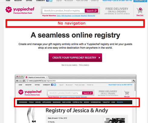
Remove any navigational panels, links, flashy pop-ups, and perhaps even social share options that adorn the top or side of our landing pages. Your landing page has to be neat and amply populated, not overpopulated.
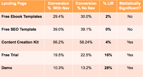
Hubspot saw significant conversion rate improvements on their landing pages after they removed links and navigation panels.


Yuppiechef had a 100% increase in sign-up rates by removing their top fold navigation bar on the landing page.

Reserve your homepage for navigation menus. Remember, your landing page needs to distraction free. Although you might want to experiment with minimalistic social share options to see if your page fares better with or without them.
A good landing page is a beautifully orchestrated film that directs the audience’s attention where it wants to. Navigation menus and outbound links get in the way of that subtle art.
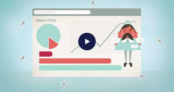
3. Use Landing Page Explainer Videos
Attention spans have been reduced to eight seconds, but the average video watch times are 2.7 minutes. So short explainer videos of 1-2 minutes in length are the way to go..
A simple animated explainer video can explain your complex business idea quickly, connect with your target audience, and influence buying decisions.
Studies say that companies using explainer videos on their homepage or landing page above the fold can increase conversions by up to 20%. Success stories include DropBox, which used an explainer video to generate 10% increase in conversion rate. It may sound like a small number, but when you do the math, that’s 10 million users and around $48,000,000 a year.
Crazy Egg saw similar success with their landing page explainer video, generating 64% more conversions in the form of $21,000 a month.

Explainer videos engage the viewer for at least 2 minutes, which means that your landing page gets two more minutes of traffic. Not only is that enough time to get people interested in your site and product, it also means that Google values your site more because of increased traffic and time spent on the site.
4. Use Custom Marketing Images & Graphics With One Clear CTA
If you can’t pull off a custom video, you can likely produce custom made graphics and images or even GIFs to engage and nurture customers.
Create images that are tailored to suit your copy and graphics needs. Custom images can improve your conversions by 40% and tailoring them to your target audience is well worth the time and effort.

For the love of all things dear to you, do not use stock images. They are someone else’s vision that you are forcing onto your audience.
Stock images are insipid and make your audience think that you aren’t willing to put any effort into making an experience worthwhile. Don’t let that be a deterrent for visiting your landing page.
5. Have Only One Call To Action
Your landing page should have one purpose. You can try to get visitors to buy a product, sign up for emails, or connect on social media. Don’t include them all on one page.
Too many CTAs means that nothing really stands out. This is as anti-landing-page as you can get.
Whirlpool’s CTR shot up by 42% when they used only one CTA in their emails rather than the four they had been using before the change.
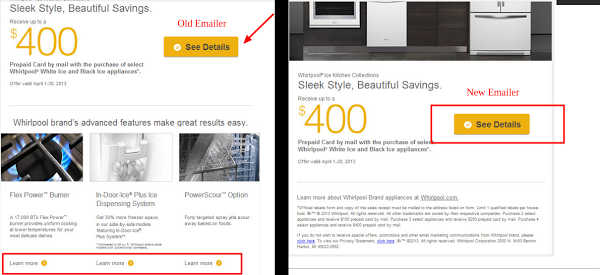

Having one CTA means that viewers have nothing else to focus on. You can lead your visitors to where you want them to go by giving the right cues.
You can also have arrows pointing where you want the viewer to look, or have subtle backgrounds that direct the focus of the viewer like this:


6. Use Testimonials: Maintain Social-Professional Credibility
You have to create and maintain value and credibility amongst your user base and visitors. The best way to do that is by including positive reviews by authority figures, Twitter cards from users of your product, quotes, case studies, achievements, awards, statistics, client testimonials and logos, etc.
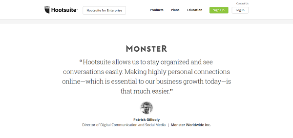

It creates a big impact to see someone or something well-known accrediting your product with trust and reliability. It can be the difference between a solid set of conversions and people leaving your landing page without doing anything.
Consumer reviews are one of the strongest sources of building brand trust, with 70% of global consumers saying that they trust reviews more than any other form of advertising. A whopping 92% consumers around the globe trust earned media, such as recommendations from friends and family, according to this report.
You can even list the number of your current users and subscribers, current online viewers, or have badges of affirmation from known brands. Dishonored, a video game, features on its page appreciation from the top notch community critics.
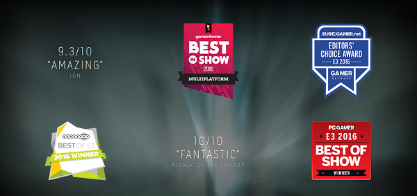
It creates a solid standing for your product to show positive reviews from authoritative and known figures.
7. Make Your Purpose Noticed: Use A Bold Heading
The point of a landing page is to grab the attention of the visitor, and your page heading is the best way to do it. It isn’t enough to simply put a heading there. It has to stand out.
Use bold text, block letters, and use a clout theme that makes the heading stand out against the background and all other elements on the page. You have to pay close attention to the copy, too.
Don’t make your heading copy vague and undirected. It is one of the first and best tools that you have to direct people’s attention to the place you want.
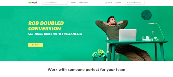
You can make your heading enticing, curiosity inducing that makes the visitor read on or prompts them to click where you want them to. UpWork is a good example with their heading that prompts the user with a catchy result-based headline.
The bold heading gets your attention and you’re more likely to click to find out how Rob got more conversions for his Upwork clients. The subheading helps add context to the attention-grabbing headline.

Or you can be very specific and tell the visitors what exactly they are getting out of visiting your page like Moz does with its sign up page:
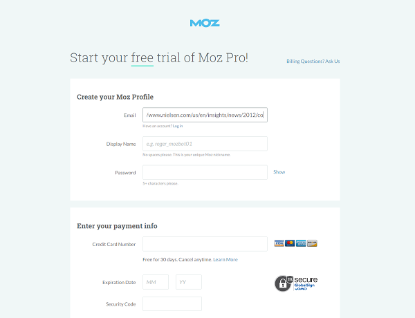

A neat heading that tells you exactly what you’re getting into.
In either case, both the pages present a strong case that catches the visitor’s attention and provides just enough details to guide the user along.
8. Be Smart: Use Few Words To Convey More
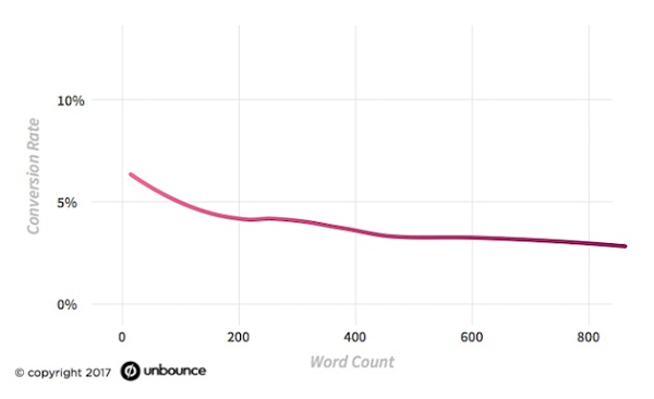
According to an Unbounce report, the higher the word count on your webpage, the lower your conversion rate.
Here’s a graph from their report which suggests that perhaps 20-30 words are your best bet to get more conversions. As you keep moving forward with your word count, the more steadily your conversion rate declines.

Keep your words simple. The simpler your message, the better people will understand what they are getting into. Don’t be fancy with your words, your landing page needn’t feel like a newspaper column or a critique.
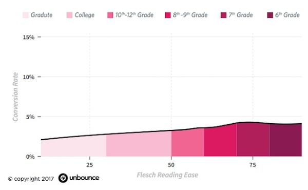
Keep your language simple; easy enough for a 6th grader to understand. Once again, according to the Unbounce report, the further you move along the reading difficulty curve of the Flesch test, the less conversions you secure.

Nobody likes to be duped and vaguely told things in a fancy language. Be simple, be precise, and cut straight to the point. Your visitors will be grateful and you will see the difference.
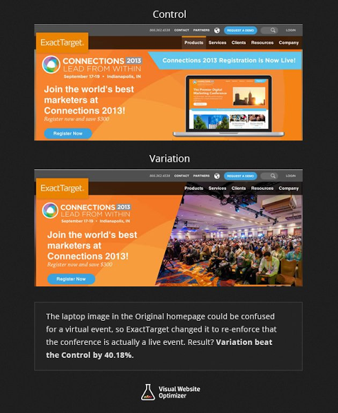
9. One Size Doesn’t Fit All: Test Your Landing Page Variations
This one is more or less self-explanatory. There’s a lot of variety on the internet: customer types, their needs, products, as well as your own image and how it is perceived.
You cannot hinge your landing page conversions on something that has worked for someone else. Sure, it might be a good strategy to that yielded results, and it may for you too, but you have to get the best out of what you are doing to your landing page.
Test what you do, implement variations, then test again. See what works out best for you.
You might add more images to your landing page when what you really needed more was a better, bolder headline. Or you might be optimizing your form fields when what you need is a better color theme,
Make a variation of different elements and see how they impact conversions and the response to your landing pages.
Once you’re satisfied enough with the results, slip that variation in for long term use. When the variation has run its course, repeat the above strategy. It’s all about hit and miss, even if you have the best strategists and practices holding your landing pages in place. Internet trends and needs change very fast. You need to, too.
10. A Ton Of Landing Pages, A Ton Of Leads
Once you have mastered, implemented and tested these techniques, it’s time to build a whole network of landing pages that cater to different audiences coming from different sources. Why?
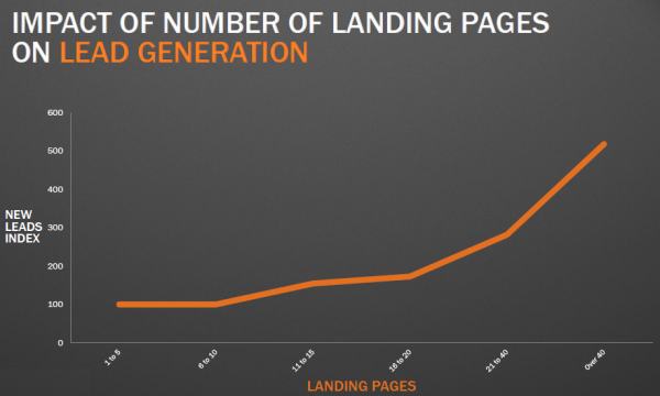
According to Hubspot, the more landing pages you have the more lead generation you’ll get.


But it isn’t simply about making more landing pages. A dozen similar landing pages are no good. Make separate landing pages for separate consumers, arriving from different places around the internet.
You have to make the experience of the user unbroken when they come to your landing page from a website.
Maintain a theme. If a user clicked on an ad that offers free e-books, don’t give them a webpage that asks them to sign up. Give them a page that prompts them with the e-book. Of course, after that you can ask them to sign up to get the book.
Remember to update your landing pages as you update the theme and graphical feel of your website and ads. You’d be losing out on conversions if the visitor feels he has landed on a different website if the color themes of what they click on and what they land on are different.
Conclusion
This is by no means a definitive list, but the methods listed above are effective enough to kickstart your attempts to plug the holes in your landing pages to get you more conversions.
Most of it comes down to testing what works for you. Your industry and the sphere you work in governs a lot of what your traffic is like and prefers, and thus influences the way your landing pages should look.
Observe, learn, test, implement, and then rinse and repeat.
Of course, don’t just wait for traffic to pour onto your site; plan marketing strategies to actively promote the landing page.
Struck gold with some technique you used yourself? Let us know in the comments. A new technique you hooked your page up with? Share with the community. Sound off below.
About The Author


Success! You will receive your free eBook shortly.