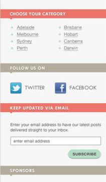
The sidebar is one of the most important parts of a blog. While people are reading your blog posts, something from your blog’s sidebar may catch the visitor’s eye. That’s exactly what needs to happen in order to get the best effect from the sidebar. However, not everything on your blog’s sidebar is going to get the right kind of attention. In order to get the right kind of attention from your blog’s sidebar, these are the five things that need to be on that sidebar.
- Social media buttons. Using social media buttons allows people to know that you are on social networks. However, you want people to stay on your blog for as long as possible. If someone has to open a new tab, then that person is not likely to stay on your blog for long. People must be able to follow you on your social networks without leaving your blog. If you can do this, then you will also be likely to get more subscribers.
- A picture of 1-3 of your products. Less is more. If you showcase all of your products on your sidebar, people are not going to pay attention. You have overwhelmed them. The best option is to only display 1-3 of your products. One of the products you display should also be priced at over $100 (ideally a training course or membership site). The logic being this is that products on the sidebar tend to get low conversion rates. When I displayed all of my books at the blog’s sidebar, the conversion rate averaged out to be just 2%. If you want to boost your conversion rate for all of your products, create pages on your blog for those products and videos as well.
- The subscription box. There is nothing on your sidebar that is more important than the subscription box. The subscription box must appear on the top of your sidebar so people who visit your blog get to see it right when they enter the URL. Do not trust people to search for and eventually find the subscription box at the bottom of your blog. No one has enough time to do that. By making your subscription box more visible, more people will subscribe to your blog.
- The search box. There will be some people who visit your blog who want to read specific blog posts. The search box will allow your visitors to find specific blog posts based on title and topic. Your search box should appear below your subscription box, and a picture (of you or your product) should separate them.
- A picture of you. Including a picture of yourself on your sidebar builds authority. When people think of your name, they don’t think about your name’s spelling. Instead, they think of what you look like. Including your picture will allow more visitors to remember you.
Those are the 5 things that need to be on your sidebar. What are your thoughts on the list? Do you have any additional widgets that you use on your sidebar? Please share your thoughts and other widgets you use below.


